
Mobile-Friendly and Accessible Websites: More Than Fitting the Screen
Review readability, navigation, forms, and interactions so more people can use the website.

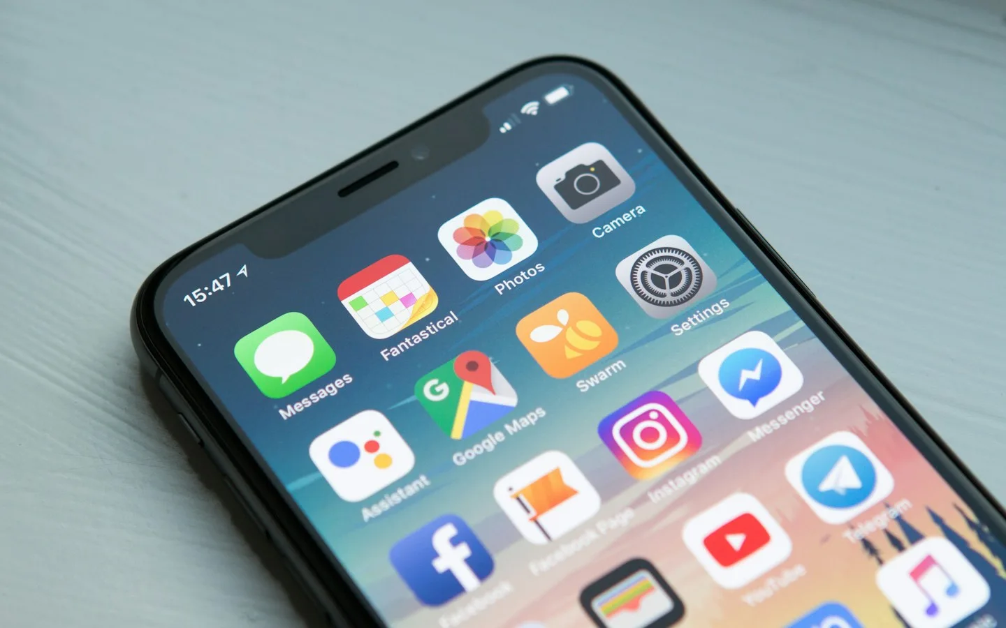
A page that fits the screen is not automatically comfortable on a phone. Text may be tiny, controls crowded, and forms difficult when the keyboard appears. Accessibility broadens the question to people with different abilities, devices, and interaction methods. Both concerns belong in design and testing, not in a final cosmetic review after the website is finished.
The key takeaways
- Rearrange content priorities for the available screen space.
- Make keyboard use, labels, and focus support the core task.
- Combine automated checks with actual task testing.
01Test real content at different sizes
Use long product names, real paragraphs, and images with different proportions. Review narrow and wide screens and rotate the device. Check that information stays ordered and remains available when the column layout changes.
Tables, menus, and cards need appropriate behavior. Avoid shrinking the whole page to preserve every desktop column. Consider stacked layouts, clear summaries, or a localized scroll area for data that genuinely needs two dimensions.
02Protect readability and user control
Choose readable text sizes and line spacing, and check page zoom. Keep text, backgrounds, and controls distinguishable. Color should not be the only way to communicate an error, order status, or important information.
Moving content should not take over attention continuously. Provide controls for automatically changing sections and respect reduced-motion preferences. People need time to read and select actions without chasing moving elements.
03Make navigation usable without a mouse
Move through the page with Tab and check that focus is visible. Menus should open, allow selection, and close predictably. Avoid elements that look like controls but lack suitable behavior or an understandable name.
Focus order should follow the reading journey. For dialogs, consider where focus moves and how it returns to the trigger. Sticky headers should not cover anchor destinations or the section someone is trying to reach.
04Give forms persistent labels and guidance
Placeholders can give examples, but do not replace labels that remain visible after typing. Explain formats, required fields, and why information is requested. Connect errors to the relevant fields so people can locate and correct the problem.
On mobile, check control placement when the keyboard appears. Preserve valid input after a validation failure. On success, provide an understandable confirmation rather than only changing a button’s color or clearing the form without explanation.
05Make checking part of the workflow
Automated tools can find some problems, but cannot assess the complete experience. Try the main tasks with a keyboard, enlarged text, and relevant devices. Where possible, include people with different access needs in testing.
Record issues by their effect on tasks and recheck fixes. Repeat essential checks when new content or components are added. A previously usable website can become difficult again if updates ignore its design and accessibility requirements.
06Illustrative example: an inquiry form on mobile
A form looks tidy on a laptop but is difficult on a phone. Placeholder-only labels disappear while typing, a floating widget covers submission, and red color alone indicates errors. Checking only for horizontal scrolling misses all three problems.
The team repeats the task on a narrow screen, with a keyboard, and at increased zoom. It adds persistent labels, field-specific errors, and space around the widget. Valid input survives validation failure. Further checks with the mobile keyboard open verify that controls and context remain reachable.
The result is recorded as an improvement to that journey, not a claim that every accessibility need is now met across the website. Other pages and new components still require checking. Accessibility becomes routine work rather than a launch-time label.
Implementation checklist
- Try narrow screens, zoom, and device rotation.
- Complete one task using only a keyboard.
- Review form labels, errors, and confirmation.
- Ensure automatic motion can be controlled.
Common questions
Does responsive design mean a website is accessible?
Not necessarily. Responsiveness concerns layout adaptation, while accessibility also includes structure, interaction, control names, and understanding information. They should be checked together.
Are automated checks enough?
No. Tools inspect only some conditions. Real tasks, keyboard use, zoom, and device interactions remain necessary to find problems that cannot be understood from code alone.
References & further reading
CHARDEN’s editorial guidance includes the following references for further technical reading. Business examples are illustrative.
Guides to websites, applications, and design to help business owners understand their digital options.
Updated