
How to Choose a Website Template Without Chasing Trends
Check structure, readability, mobile usability, and customization needs before choosing a design.

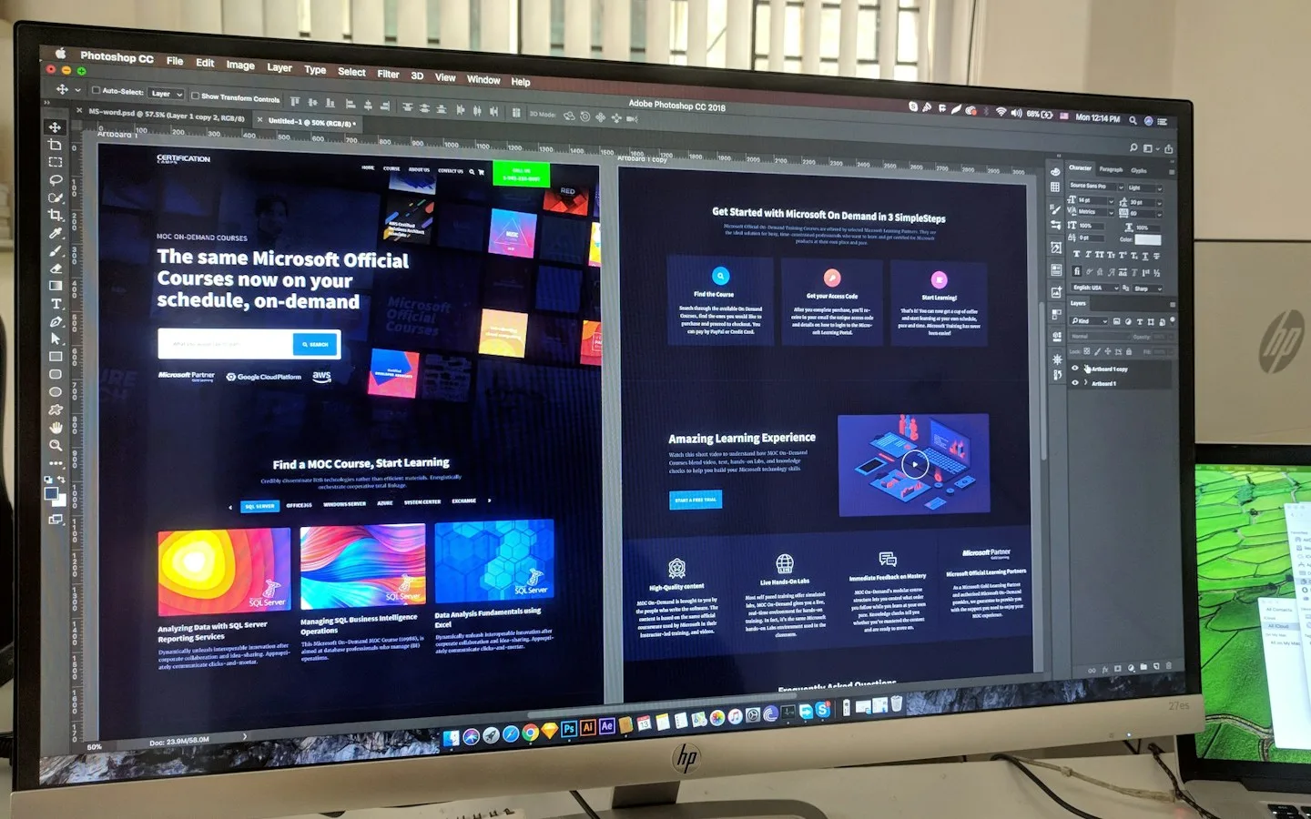
A template gives a project an existing visual foundation. An impressive demo, however, may not suit your product range, information, or customers’ habits. Choosing one should be an exercise in matching requirements to structure, rather than picking the most striking image in a gallery. Testing with realistic material makes that decision much more reliable.
The key takeaways
- Review the complete journey, not only the opening hero.
- Test real content and mobile layouts before approval.
- Clarify customization, asset licensing, and post-launch editing.
01Define requirements before opening the gallery
List the information you need: services, products, projects, locations, team profiles, or forms. Add approximate page counts and language requirements. This creates a consistent filter, so a different color scheme or animation does not reset the decision each time.
Separate working features from visual examples. A cart icon does not prove payment processing exists. Ask whether search, filtering, forms, and editing tools are implemented or require additional development. A clear feature list is more useful than assumptions based on a screenshot.
02Try your own business content
Demos often use short headings, coordinated images, and carefully selected text. Try longer service names, ordinary product photography, and your actual address. This reveals whether the layout remains readable when it contains the information your business really has.
A hypothetical building-supply shop has different product names and units from a fashion brand. A catalog for five featured products may not work for hundreds of items. Consider categories, search, and product details around how customers make their selection.
03Test the whole journey
Start at the homepage, locate a service, open its details, and take the intended action. Check navigation, return links, and contact routes. Looking only at the hero misses problems that often appear on detail pages and forms.
Repeat the task on a phone. Check the menu, image cropping, form fields, and long text. Responsive design should rearrange information for available space, rather than shrinking the desktop page until it becomes difficult to use.
04Check accessibility and visual weight
Text needs readable contrast and should remain usable when enlarged. Try menus and buttons with a keyboard. Look for visible focus and form labels that remain clear while typing. These details affect everyday usability, even when the initial visual impression is strong.
Animation can support the presentation, but should not hide information or make controls hard to select. Ask what happens when reduced motion is enabled. Large videos and oversized images also deserve attention when customers use limited mobile connections.
05Agree on customization and handover
Clarify included changes to colors, typography, copy, sections, pages, and integrations. Distinguish visual adjustments from changes to business workflows. Recoloring a button is a different task from adding a complete reservation system.
Discuss the use of demo photography, fonts, and other assets. Agree on account access, editing instructions, and support arrangements at handover. A good template is one the business can operate and maintain, as well as present attractively.
06Illustrative example: comparing three designs
A cleaning company compares three templates using its longest service title, field photographs, coverage areas, and customer questions. The same material is placed into each design. This avoids favoring one option simply because its demo uses more attractive images or shorter text.
The test is to find office cleaning, understand the scope, and request a site assessment. Record missing information, not just click counts. Repeat on mobile and with a keyboard. The strongest fit supports that task with customization the project can reasonably accommodate.
Before deciding, list required and optional changes for each option. One may need a new detail-page structure while another already fits. This makes time and scope discussions more concrete and avoids assuming that every template requires the same amount of adaptation.
Implementation checklist
- Prepare a long heading and real product information for testing.
- Inspect service details and test forms only where the demo permits it.
- Check navigation, keyboard use, and mobile layouts.
- Request a list of included changes, assets, access, and support.
Common questions
Must the demo category match my business?
Not necessarily. Structure and workflows matter more than the category label. A restaurant layout may not suit technical products, while a clear company-profile structure can work for several businesses after adaptation.
Is replacing the images enough?
Not always. Copy, information priorities, actions, and detail pages must fit customer needs. New photography changes the visual identity, but does not fix an unsuitable structure.
References & further reading
CHARDEN’s editorial guidance includes the following references for further technical reading. Business examples are illustrative.
Guides to websites, applications, and design to help business owners understand their digital options.
Updated